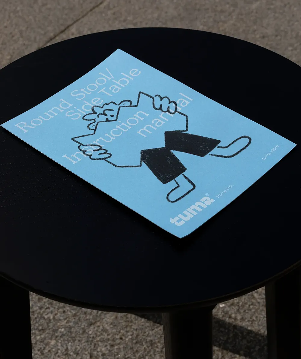
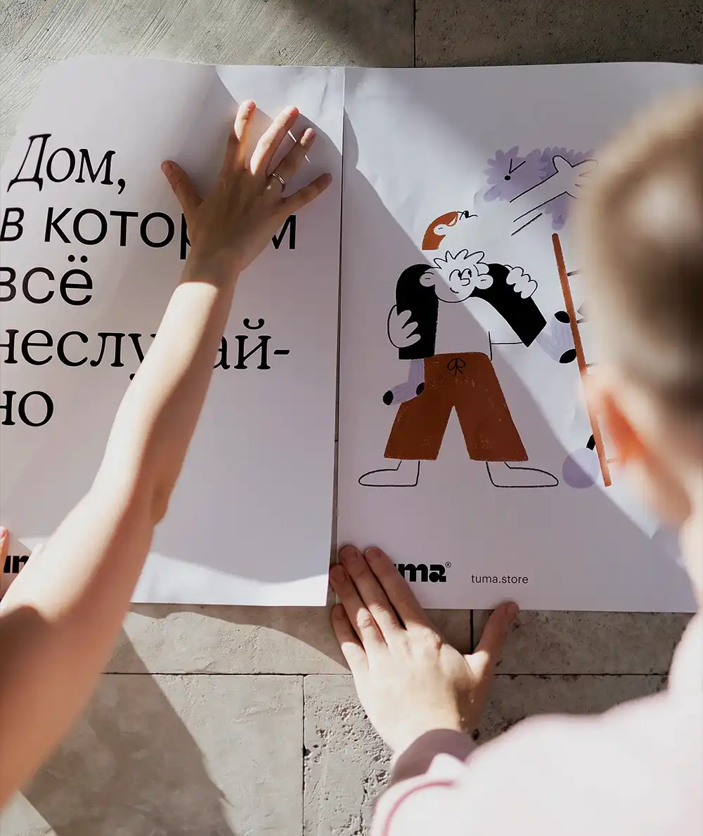
Tuma. Furniture & Home Accessories
Brand Identity, Creative Direction, Packaging, Art Direction
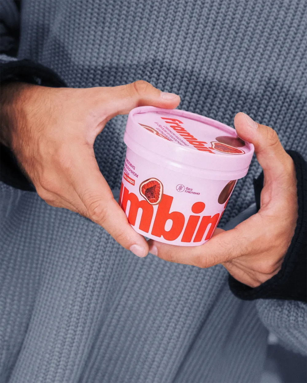
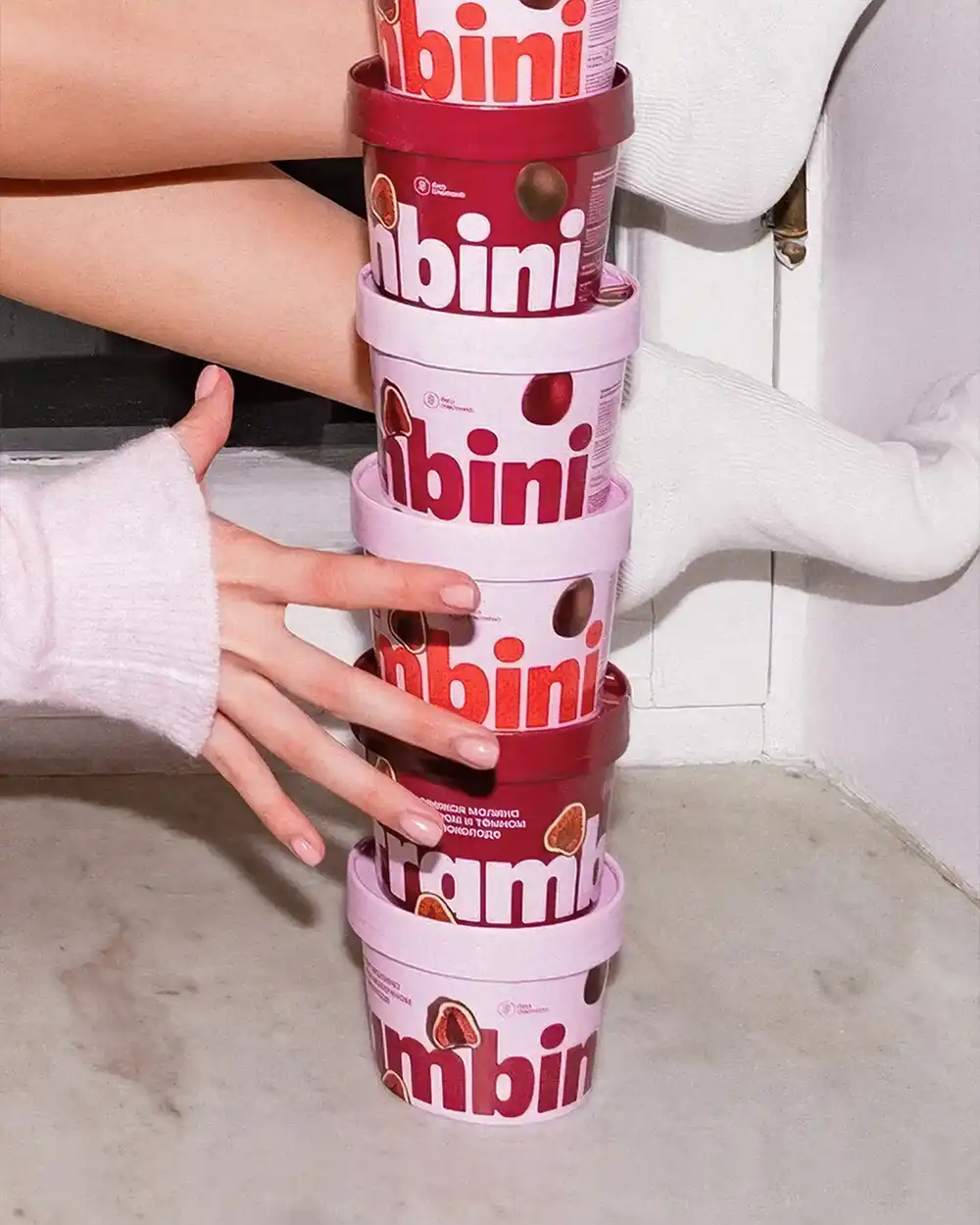
Frambini. Chocolate-covered Frozen Raspberries
Brand Identity, Packaging Design, Art Direction

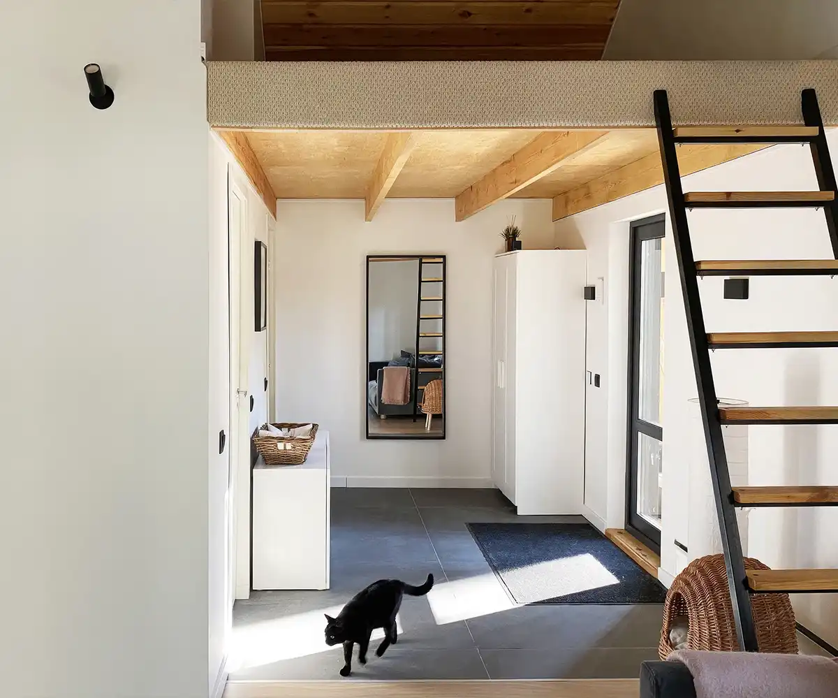
Barn Black. House
Architecture Concept, Interior, Supervision

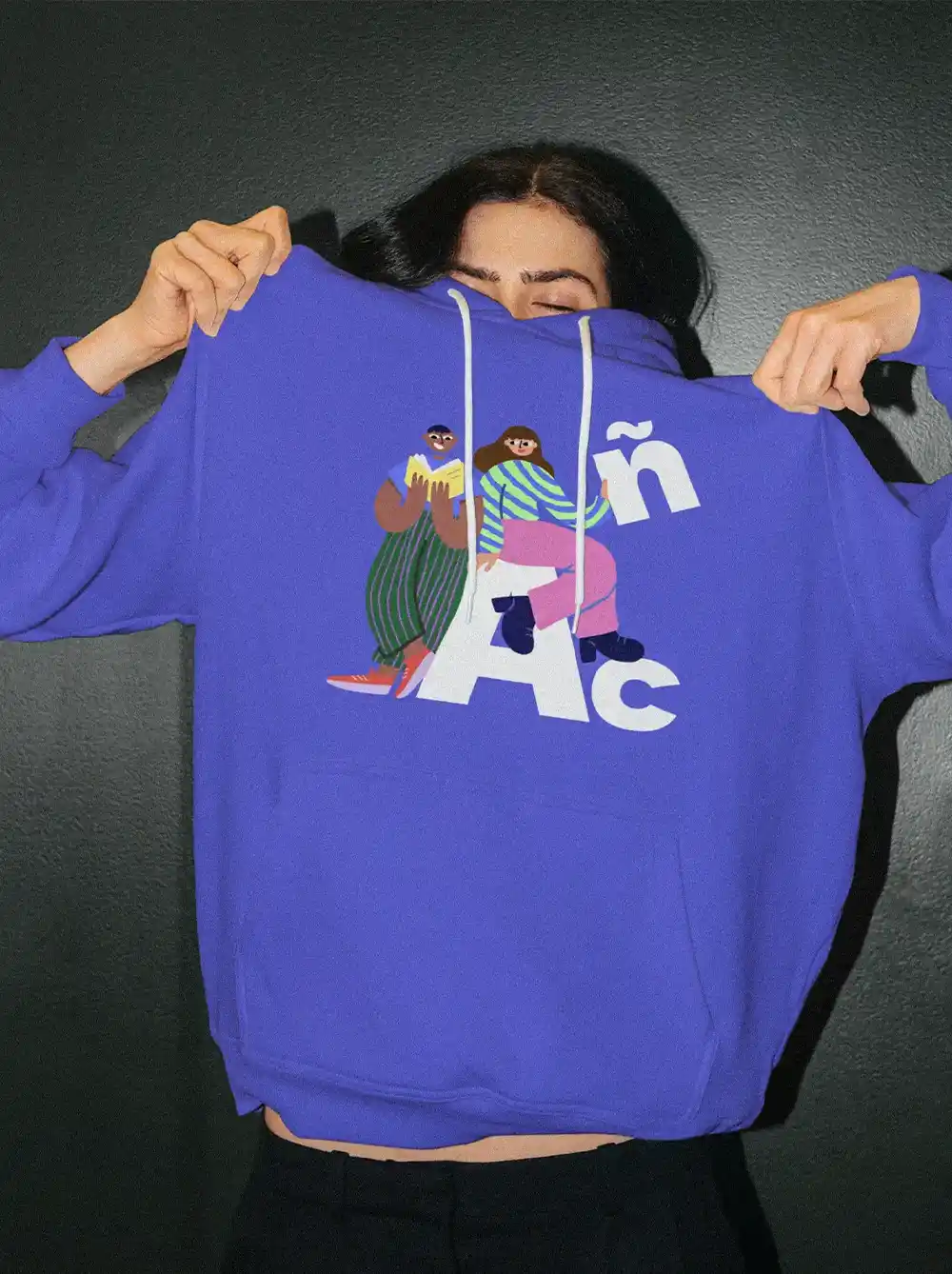
Freeda. Language School
Brand Identity, Design System, Art Direction, Website

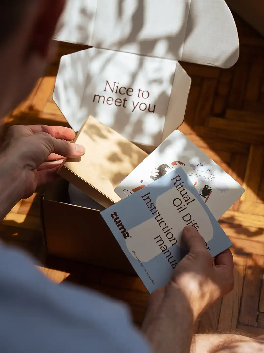
Ritual Oil Diffuser
Product Design, Prototyping, Design Implementation


Selected Output
Multidisciplinary Design & Art Direction
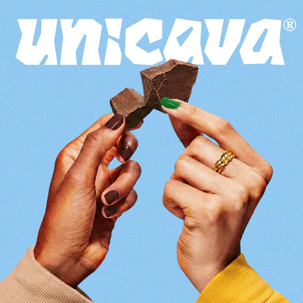
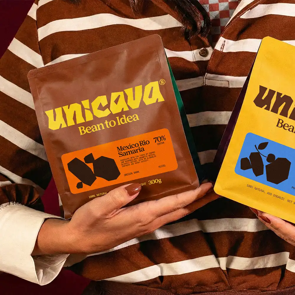
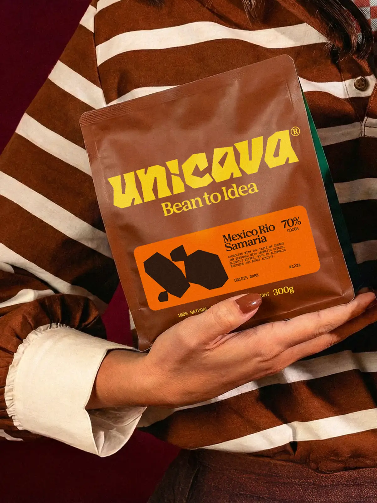
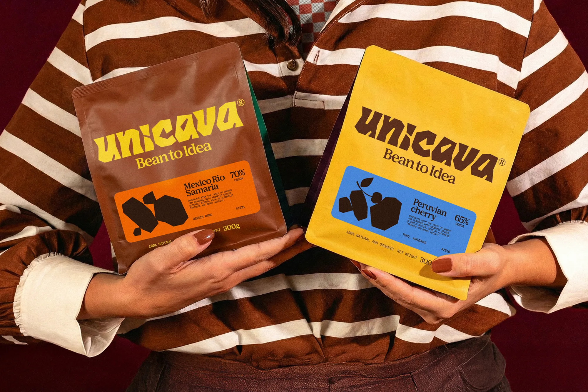
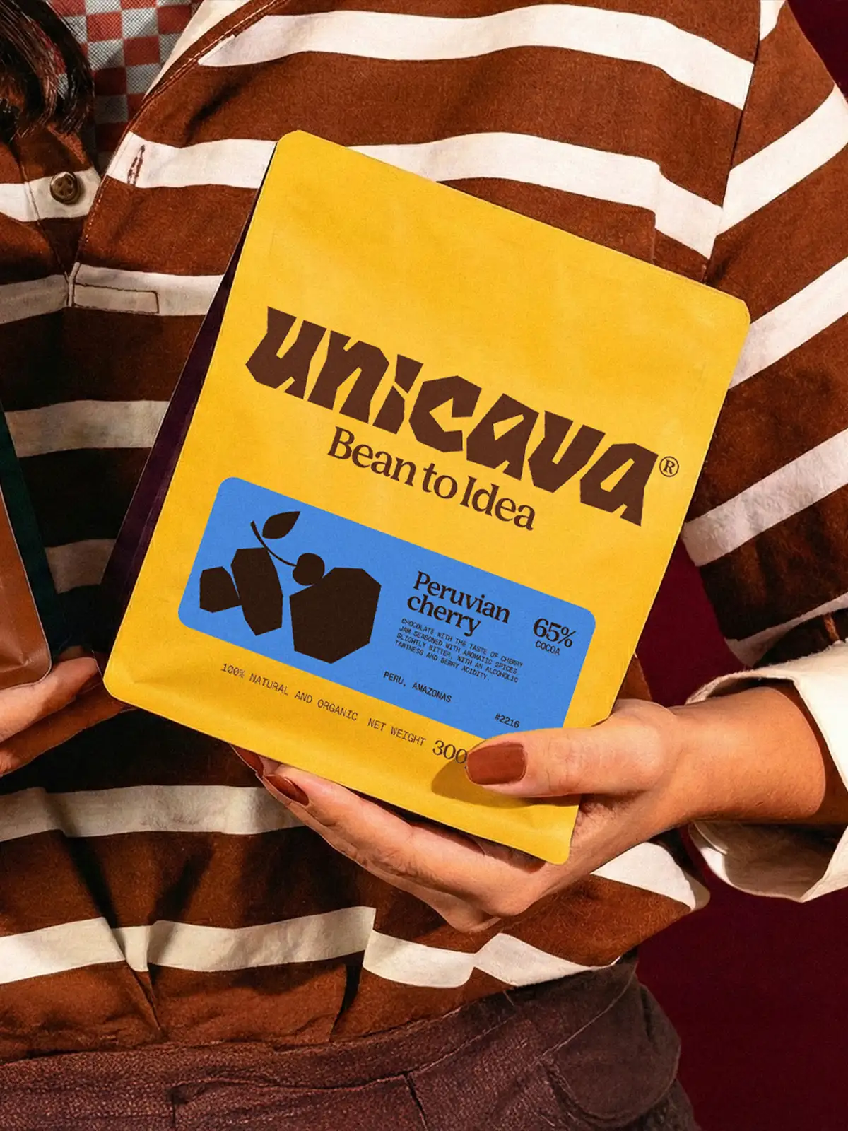
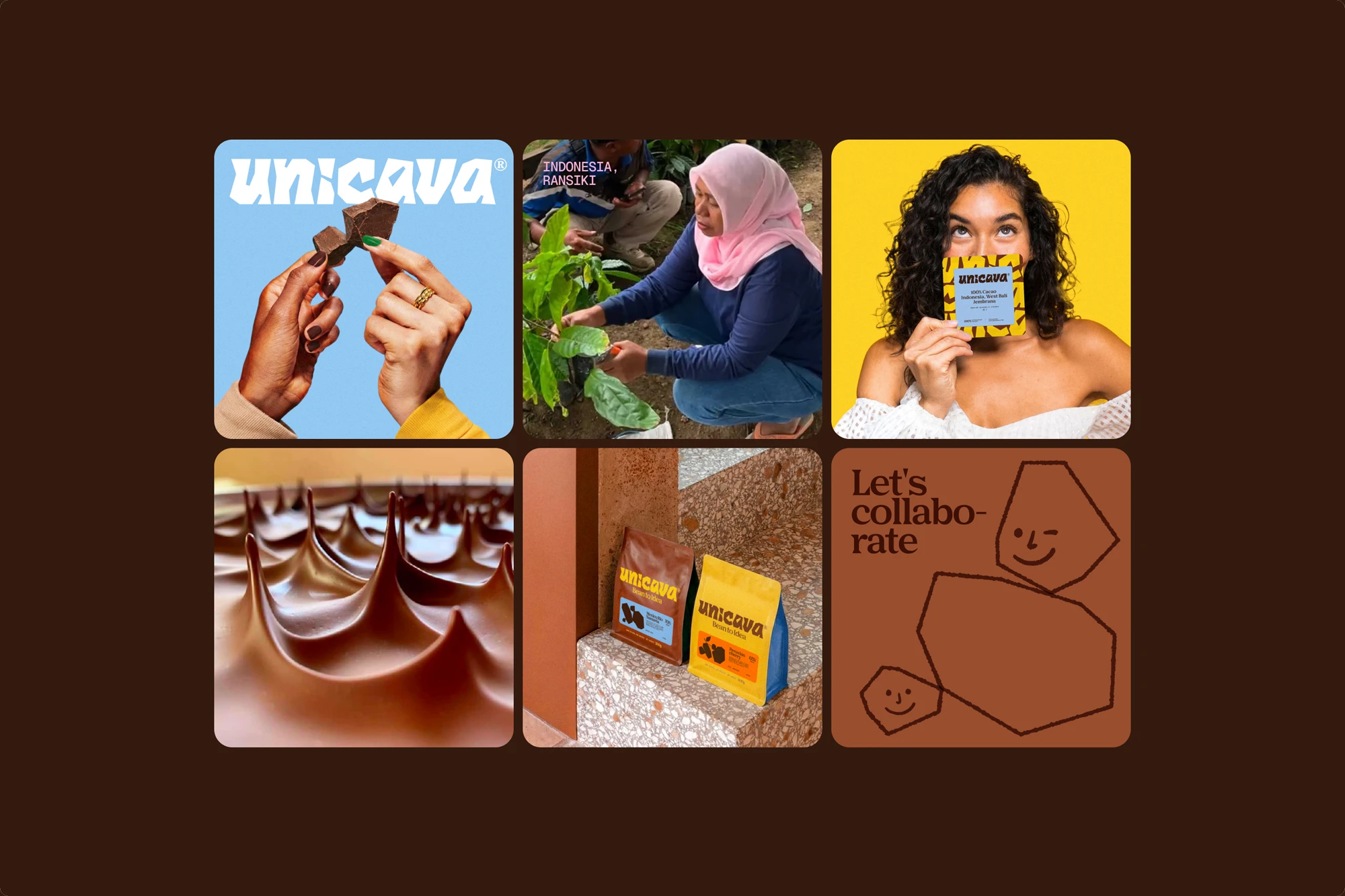
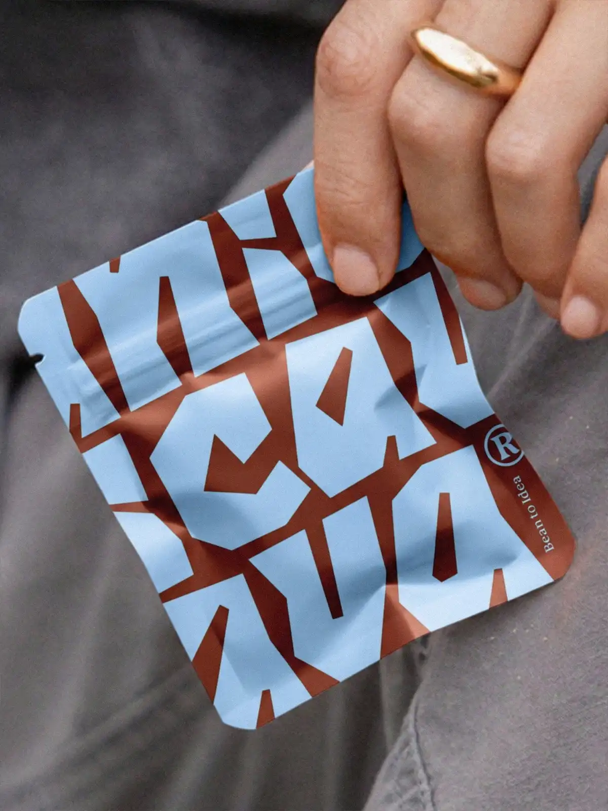
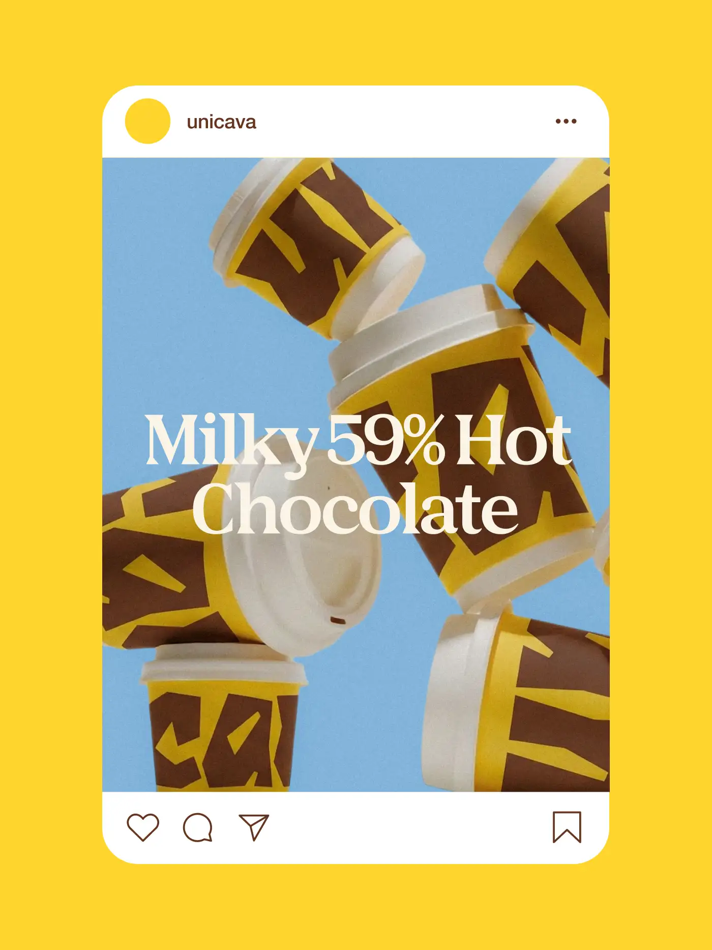
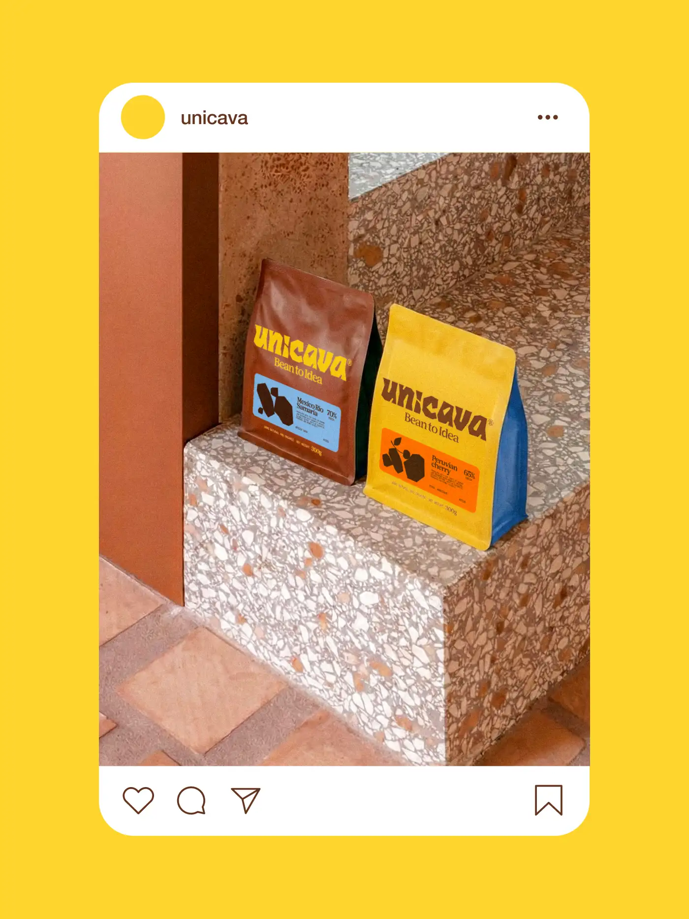
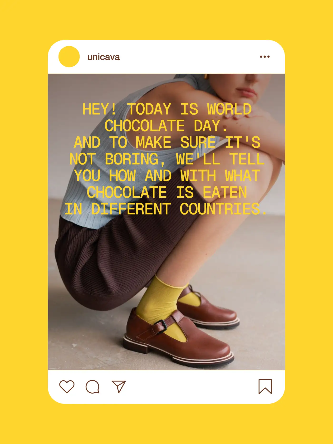
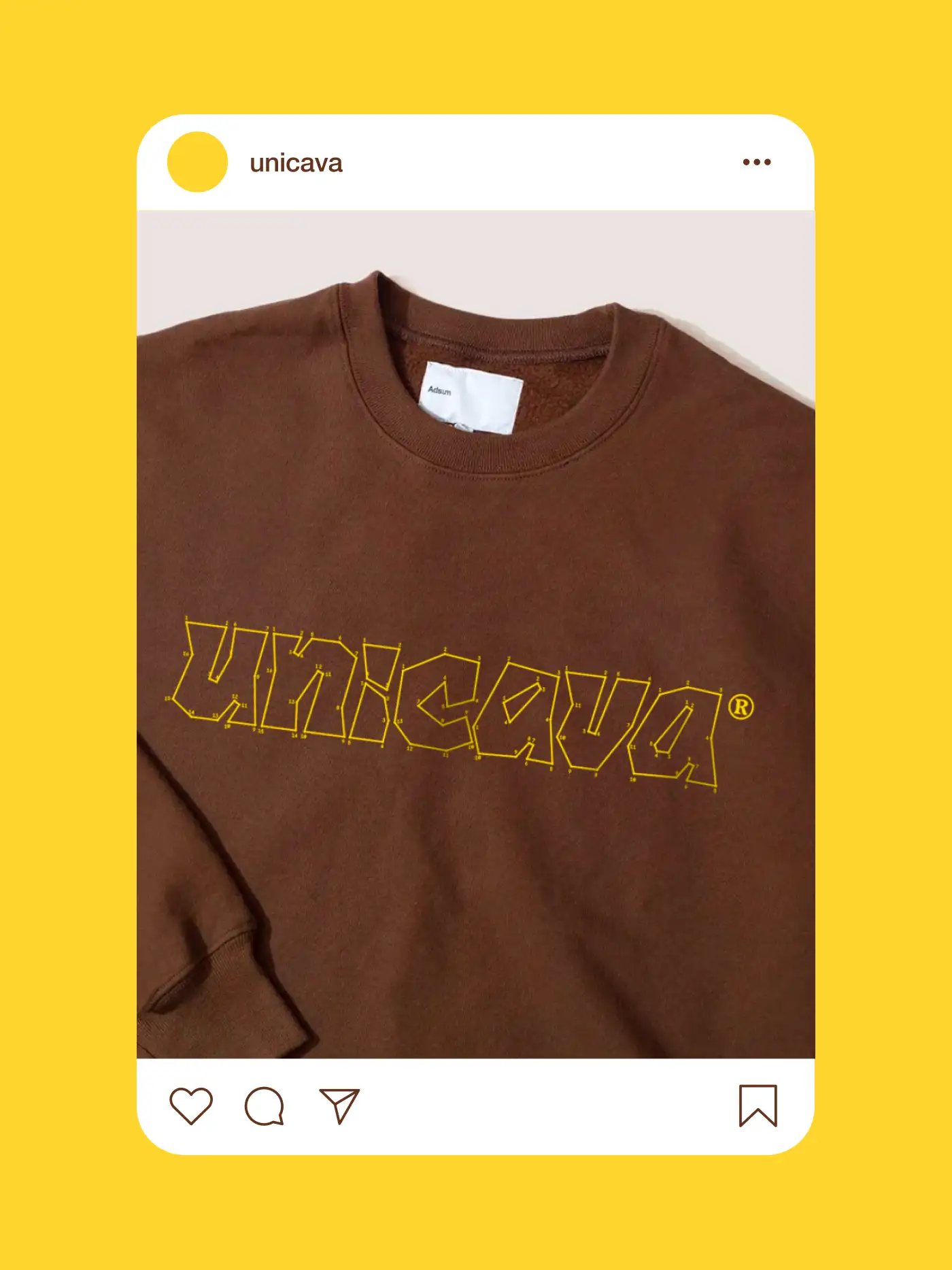
Unicava. Chocolate
Brand Identity, Packaging Design, Art Direction


Steel Oak Leaf. Bookend
Product Design, Prototyping, Design Implementation